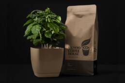
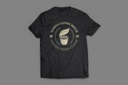
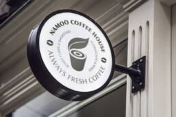
Namoo Coffee House
The branding design for Namoo Coffee House.
The word “Namoo” means tree in Korean, and the coffee house operates with the motto of being a healthy and clean coffee shop. This sense of health is naturally conveyed through leaf imagery, while the coffee cup design draws inspiration from tree rings, reinterpreted as a battery icon. This symbolizes the idea of recharging energy by enjoying a cup of coffee.
The overall design embodies the brand’s eco-friendly and energetic values, effectively delivering Namoo Coffee House’s message of health and positivity to its customers.
Client Namoo Coffee House